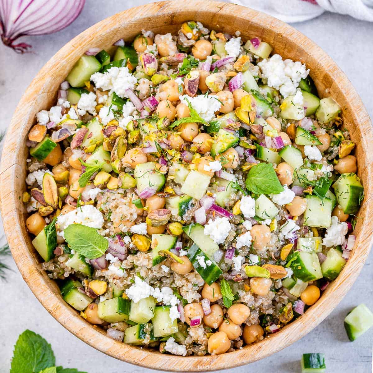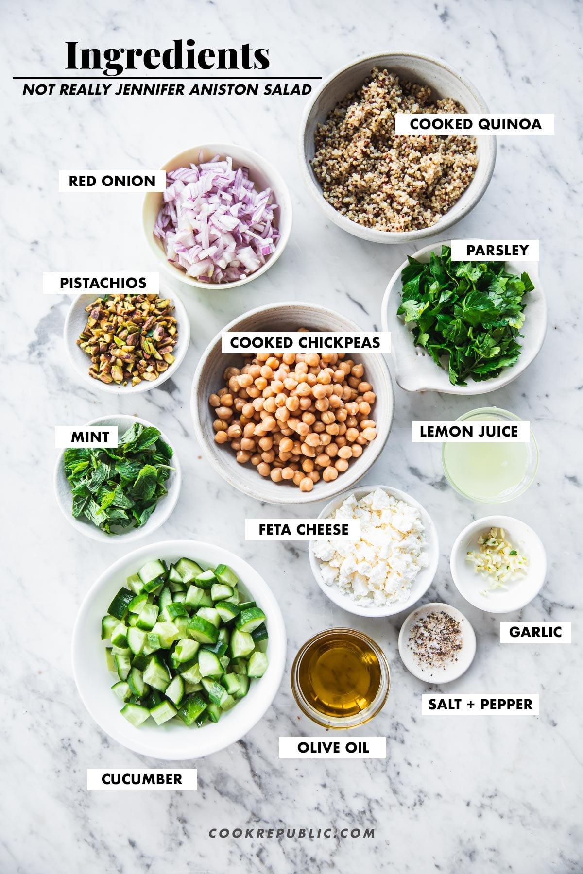


Some sources say she ate the salad every day for 10 years while filming the show Friends, but after a little research I found that this is actually a salad she shared while doing an Instagram takeover for the Living Proof brand. In the caption Aniston said the salad, with bulgur, cucumbers, parsley, mint, red onion, chickpeas, feta cheese and pistachios was her “perfect salad.”
Ingredients:
• 1 cup Quinoa, uncooked
• 2 cups Water
• 1 cup Cucumber, chopped
• 1/2 cup Parsley, chopped
• 1/2 cup Mint, chopped
• 1/3 cup Red Onion, chopped
• 1/2 cup Pistachios, chopped
• 15 oz Chickpeas, drained and rinsed
• 1/4 cup Extra Virgin Olive Oil
• 1/2 cup Crumbled Feta Cheese
• Sea Salt
• Ground pepper
Instructions:
1. Rinse and drain quinoa. Add quinoa and water to a small pot and bring the water to a boil. Reduce to a simmer, cover and cook for 15 minutes. Fluff with a fork and let cool for 5-10 minutes.
2. In a medium bowl, stir together cooked quinoa, cucumber, parsley, mint, red onion, pistachios, chickpeas, lemon juice, olive oil, salt, pepper and feta.
3. Serve immediately or let the salad chill in the fridge a couple hours before serving.
4. Store salad in an airtight container for up to 5 days in the fridge.
Recipe Websites:
1. Love & Lemons:I liked the calm, minimalistic, yet decorated feel of this website. I think that each recipe is easy to navigate. There is also a dinstinctive visual system that I appreciate, with similar filters on imagery, as well as typefaces that fit to the cooking aesthetic. I like the use of black lines as borders and yellow as subtle highlights.
2. Minimalist Baker:This website has very clear labels for allergies and dietary restrictions. There are many different sections and methods to discover recipes, especially on the home page. The pictures are quite large and easy to follow
3. Serious Eats:This website has a beautiful designed set of divisions for establishing different categories, like reviews, a "why it works" section, details, ingredients etc. options. There was very clear iconography, a tasteful use of colors, and an overall aesthetic appeal that also has relevant content to the dish.
Non-Recipe Websites:
1. Simply ChocolateThis website had a nicely laid out grid that made the visual scrolling experience feel very cohesive. When clicking into a chocolate product, I appreciated how much of the information was divided with this grid, and with colorful backgrounds.
2. Franz Hal Museum:This website has a clear visual language. Everything from the typeface to the image treatment to the icons are rounded, making the site feel extremely tight and cohesive. Every action I do feels extremely intuitive.
3. Hello Monday:This website definitely looks like a true feat of UI. Every movement is extremely smooth and everything is an interactive experience for the user. The hierarchy for each project is also very digestible and clear.